Author: carollaquie@gmail.com

  • 3. Question 3 

    3. Question 3 

    Visit the St. Clair College website. Analyze it strictly from a visual marketing strategy perspective targeting: 

    Local domestic high school students. 

    You are to provide three strategic visual enhancement recommendations. For each recommendation: Visit the St. Clair College website. Analyze it strictly from a visual marketing strategy perspective targeting: 

    Local domestic high school students. 

    You are to provide three strategic visual enhancement recommendations. For each recommendation: 

    a) Clearly identify the issue or missed opportunity (3 x 2 = 6 Marks)

    1. Lack of engaging and emotionally student focused visuals:

    When viewing the homepage and Student Hub, one of the major issues that stood out to me was the lack of visually engaging and appealing images that do not display much of the student life, career events, and popular programs. These visuals could’ve all been put in the hero image section using high-quality lifestyle photos or short muted video clips that communicates the student life, instead of a text section which most users wouldn’t see without staying more than 30 sections on the homepage. Most of the images or visuals were generic and static with a lot of focus on informational text. From a marketing perspective, this is an opportunity missed and could’ve been used to emotionally connect to the local high school students. The visuals don’t effectively communicate the student life and the energy of the campus for students wanting to have a college experience. The site is focused on being more institutional than being aspirational which reduces the ability to attract students looking for a relatable college.

    1. Poor visual hierarchy and lacks engaging structure

    Some of the content and visuals on the homepage blended into one another making it confusing to know which section it belongs to which. Cutoff lines that indicate where different parts of the page like events calendar and career event, their lines were so close to one another that it could cause students to click the wrong link. This makes it hard for high school students because they now have to use their brain to follow the content on the page. From a digital marketing perspective this leaves a weak first impression because the page doesn’t quickly communicate any key information. St. Clair missed an opportunity to add an image slider element and to highlight what it’s like going to the school and what makes them different. 

    1. Weak use of brand color

    Lastly I reviewed the Early Childhood Education program and saw that the images in the news section were a bit off which made the visual content really weak. The color tones were dull and had a dusty shade of yellow on the news section image on the page which I believed was meant to incorporate St. Clair yellow brand color. It doesn’t add any visual appeal that will make students want to stay on the page for long. For a program that is focused on kids and children education, St. Clair missed an opportunity by not adding visuals that were clear without having to interact with it.  

    b) Propose a specific visual improvement (3 x 2 = 6 Marks)

    1. A dynamic hero section with student focused visuals

    The homepage and program pages should include a full hero section displaying high quality images or muted video loops showing the student life on campus, the classrooms, and job opportunities graduating students got. Since the pages are text heavy, adding images leaves a good first impression. This specific visual component would immediately capture the attention of the high school students and inform them what they need to know without having to read about it. 

    1. Improve color scheme 

    Program pages like Early Childhood Education, I think need to add more vibrant and engaging images that showcase the different experiences students have in their placements. These pictures will not have any filter on it that does not match their natural lighting just for the sake of adding a brand element. The images will be clear to showcase high quality visuals of the classroom environment, clubs, etc. This will remove any unintended color visuals from the content, making it more easier to see instead of getting scanned over. 

    1. Add a visual to improve navigation

    Since the content on the homepage somewhat blends into one another, there could be an engaging featured section that  highlights the most popular programs with minimal text. This would make it clear when a section ends and when it begins without getting users confused. 

    c) Explain why it would improve recruitment effectiveness (3 x 2 = 6 Marks)

    1. A dynamic hero section with student focused visuals 

    Adding a strong hero slider image that is student and program focused would improve the effectiveness of recruitment immediately with visuals showing the student, work experiences and opportunities which will leave an impression and emotional connection with the students. With a clear section, adding this feature allows them to imagine themselves in these programs or experiences. It makes the college look more relatable and appealing, this can encourage them to want to explore the website with a bit of excitement instead of boredom.

    1. Improve color scheme

    With St. Clair College brand color being a bit restricting and not one that can invoke a feeling when you see their colors. However, changing the color and visual elements on the pages like adding important information with an image next to it like a graduates picture that says the percentage of people that have graduated the program. This builds reassurance and would improve the recruitment because the students would feel like they made the right choice. 

    1. Adding a visual navigation

    Adding things like an image slider on the homepage or program page, can improve the recruitment effectiveness by guiding users to important information on the page. Like the homepage having the programs in the hero section which people can click on so adding a slider means students can easily click on a CTA button if they see an information that interests them. The visual element acts as a guide and it lessens confusion when navigating the web content. It’ll be easier for students to quickly find information that excites them. This helps increase engagement and the overall decision process.

    d) Connect it to student psychology and digital behaviour (3 x 2 = 6 Marks)

    1. Dynamic hero section with student focused visuals

    From a student psychology perspective, high schools are more likely to engage with content they can envision themselves in and feels relatable. Seeing visuals of what the campus and program offers shifts their perception and creates a desire that if they join their program of choice, they too would experience what they see on the website. 

    1. Improve color scheme

    Since web visuals are the norm in today’s digital world, many people are used to seeing visually appealing and interactive content. So from a student psychology standpoint, students are naturally drawn to visually appealing or stimulating content. When the colors and visuals are aligned, it makes the content easier to process and engage with because it holds their attention. 

    1. Visual navigation

    From a digital behaviour perspective, students like the majority of internet users, they prefer having simple experiences when choosing to engage with a content. It makes them feel in control but also guided instead of being unclear where to locate information. A visual navigation that has the right white space reduces any cognitive effort making the navigation clear to explore information quickly. 

  • Question 2b (8 Marks)

    Explain in detail how the image(s) strengthens the post from a digital marketing perspective.

    You may reference:

    • Attention economy

    • Scroll behavior

    • Visual hierarchy

    • Brand perception

    • Trust building

    • Emotional triggers

    • Information processing

    • Conversion influence

    Be analytical. This is not a design reflection. This is marketing reasoning.

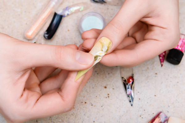
    These images strengthen the post from a digital marketing perspective because it aligns with how most users consume content nowadays. According to my class ppt “The Power of Visuals (W26)” page 4, about 80% of visual content seen is retained in the user’s memory which makes visual content more effective than the text alone. In the digital space, most of the platforms used by everyone like Instagram, Tiktok, and X(Twitter), are heavily visual driven with X being both written text and visuals.  This means that users are constantly seeing these to the point the brain processes the content they see quickly through images before they read the text and most times they don’t read the text. This perspective connects directly to the scroll behavior where users are constantly scrolling through their content fast and it is hard to get them to stop unless visual is added and it stands out. By using the high quality images to communicate a nail transformation, the post is able to capture the attention of users immediately and convey the message to them without much effort from the users. 

    In addition to this, the images also improve information processing and can influence the users to remember the content and potentially take action. Since about 65% of the population are visual learners, showcasing the process and results like this really allows those who are visual learners to quickly grasp the value of the post faster. Adding the before and after also helps with building trust and help shape the brand credibility by realistic results which reduce any uncertainty users have. This post also triggers an emotional response because it allows users to visualize themselves with the same outcome which creates a sense of confidence they can have in themselves when they follow the visual steps.

  • Question 2a (8 Marks) 

    Why did you choose the specific image(s)? 

    Your explanation must include:

    a) Business relevance 

    I chose these images because they directly support the main product value of my business and they convey the message that I’m trying to communicate with my audience which is that my press-on nails are high-quality, convenient, and a faster alternative to salon nails. The blog is titled “Your 15-minute Press-On Nail Guide” which means that the content on the blog has to guide readers interested in a quick application guide for their press-on nails. So the visuals I chose needed to reinforce that idea of speed and simplicity while the results match salon finishing style. Instead of telling users how good and effective the nails are, adding the before and after images was essential as it shows users how simple it is to transform their nails from basic and bare to stylish and durable. I believe that focusing on visual transformation and how simple it is aligns with my business goal by making my products feel accessible, durable and worth purchasing without having text descriptions to influence further action. 

    b) Target audience alignment 

    These images align with my target audience of young, stylish consumers who engage in visual content on platforms like Instagram or Tiktok. They prefer content that is direct and can easily be scanned to understand the message being conveyed.

    c) Image intent 

    Each image is meant to guide users so they each serve a specific purpose. The before picture acts as a starting point of the application. It simply tells users that this is the starting point of putting the press-on nails on which shows how simple and accessible the step is. The after picture demonstrates the final result and what the users nails should look like at the end. Altogether they create a visual sequence that communicates the transformation process with very minimal text that you would miss if you didn’t look closely.  

    d) Why this visual works better than alternative visual approaches

    This visual works because it communicates the message in a simple and effective way. I could’ve chosen to add more text to make the guide more in depth, however since my audience is visual first, the heavy explanation would turn them away from the post. I wanted to reduce their mental effort and allow them to quickly understand the content within seconds of reading the post. 

  • 2. Question 2

    Your 15-Minute Press-On Nail Guide

    Start:

    Apply:

    Done!

    Before:

    After:

  • 1. Question 1

    Visuals are not decoration. They are communication tools. Provide three strategic reasons why visuals are essential to effective web content. 

    For each reason:

    • Clearly explain the concept 

    • Provide a real-world example (not generic statements)

    Marks are awarded for depth, not surface-level answers. (6 Marks)

    3 Strategic Reasons:

    1. Communicates A Message Faster:

    Nowadays the majority of people of all ages are phone or internet users. According to “The Power of Visuals (W26)” by Scott Briscoe page 4, about 65% of the population are visual learners which means they process and learn information more effectively when it’s presented visually instead of through text alone. 

    This is very important when it comes to creating effective web content. The majority of users don’t usually read web content but scan through them and visual infographics or pictures are a perfect way to grab their attention. As discussed in class, the human brain processes visual content faster than text and it takes people milliseconds to understand an image especially if the message requires too much reading. 

    A real world example of this can be seen directly in the DoorDash app. When users search for a restaurant or go on their  menu options, they’re usually shown visuals next to the meals so they get a visual image of the meal. Having those images beside the meals influences their decision and this is true because it’s how I order food from restaurants I’m not familiar with. For example, when users search Church’s Chicken on Doordash and see their high-quality Chipotle Onion Crunch Sandwich picture. It communicates its crunchy taste, and they can instantly see the sandwich’s crunchy appeal and it can influence them to take action. However if Doordash were to remove the picture option and only relied on their written description, most users would lose interest and leave the restaurant unless they were regulars. 

    1. Catches Attention When Scrolling 

    Visuals are very important to utilize in web content because if you choose the right visual element like a picture or video, it will stop users from scrolling and be curious enough to interact with your content. Today people are exposed to a lot of information to the point it’s becoming an information overload. As shown in class, only about 28% of people actually read the text on a webpage, the majority of the time they scan it. Platforms like Instagram or TikTok are heavily visual oriented so the human brain has adapted to process an image quicker based on the elements it has. Visuals can be used as a first impression starter to catch users attention to make them question if your content is worth engaging with. 

    A real life example is Spotify, when you open the app there’s usually a popup of the latest album asking you to listen to it. However, the app is a visual page with minimal text. The colorful, creative album covers that stand out influences listeners to check out the music. The visuals along with the text adds curiosity and guide users to listen to the music to the point most users don’t even know that spotify albums and playlist comes with mini descriptions. Spotify brings users simplicity with minimal words. 

    1. Improves Memory, Understanding and Decision-Making

    Visuals helps users comprehend information quicker without needing words. They are known to influence users buying decisions on ecommerce websites. With the statistics being that about 28% of people read text based content while 65% of people process information quicker when they’re visual. This is because text information without visuals makes people leave a pager faster and they tend to forget what they read. Whereas visuals can quickly communicate a message using an image or video that emotionally connects with users it sticks with them, causing them to remember the visual content and sometimes have them take the needed action. 

    For example the Ikea instruction manuals, Ikea use minimal written instructions but use pictures to guide users step-by-step how to put together their furniture. The pictures are meant to be clear so it doesn’t cause any confusion and those with no skills in building furniture will feel confident to follow the instructions which improves their customer experience and trust. Ikea demonstrates that visual instructions are just as effective as written instructions, in fact it’s better because the visuals walk users through the instructions in a clearer way than a written text would.

  • 4. For question #2, what did you do differently from the original post? Please outline, explain and justify what you changed & why. Essentially, what did you learn from this new topic and what did you change and why? (8 Marks)

    What I did differently was rewriting the content to make it more clear, structured and personal based on what I learned in class. My original version had a lot of long sentences and repetition which made my content more lengthy. It made my content feel wordy and hard to follow so I decided to change that when I rewrote it. In the revised version, I simplified my wording and made the message personable but direct by shortening my sentences. 

    I changed the structure a bit while utilizing the F-pattern to make it more shorter and scannable as my original version was a bit longer which I believe will make it easier for readers to read. I also changed the tone a bit to make it less generic like my original version and make it more personal and relatable. The changes I believe made the content more easier to scan and read and while connecting to readers. 

    Overall,  I learned how to utilize plain English alongside the F-pattern to make my writings more clear and easy to read without sounding complex. 

  • 3. For question #2, explain how your new post successfully addresses the three main objectives of Plain English writing as discussed in class. Provide a detailed breakdown of each objective. (9 Marks)

    The 3 main objectives are:

    1. Clear: In my revised version, I focused on one problem that my brand solves and used it as an introduction to get readers to check out my website. I wanted to make everything clear and easy to understand without word dumping. When I read my old version again, I realized I wasn’t as clear as I wanted to be. I wanted my content to be easy to understand so readers can quickly get the information they need without searching for it. 
    2. Concise: I decided to make the information I was presenting short and concise. So I decided to cut down on my words and shortened my sentences. By doing that I was still able to communicate my value without word dumping on readers.
    3. Readable: I rewrote this version in a way that was readable and scannable so readers can scan through information and get what they needed. 

    a) Describe one specific technique you used to improve readability in your revised version and explain why it is effective. (4 Marks)

    One technique that I implemented was being consistent with personalizing the content. I used words like “your” and wrote things I know nail lovers can relate to. For example I wrote “Our Claws are yours if you’re tired of…”. By doing this I was able to include my readers. Overall this technique is connected to real life experiences many nail lovers have like the cost, nail damage and more.

    b) What was the most challenging aspect of applying the F-Pattern and Plain English writing principles? How did you overcome it? (5 Marks)

    For me the most challenging part of applying the F-pattern was balancing being personal while still following the structure of using plan English and the F-pattern. I didn’t want to come off too formal or generic in my writing so I decided to go the personal route to make readers feel included so the content is relatable to them. I struggled making it cohesive and readable. Even though I wanted the tone to sound personal, I had to make sure the content was still clear and concise so the information was easy to read. To overcome this, I put my focus on making my sentences short and using bullet points which helped overall in keeping the tone personal but the content was still clear and structured.

  • 2. In a previous assignment, you wrote an introduction article in the “F” pattern. Based on what we discussed in class and based on the feedback provided in class, write a new introductory “content” incorporating “plain English writing for the web” in the “F” pattern including visuals. You are to include your “revised version” (if the version you submitted was not in the F-Pattern). Ensure that it addresses the three main objectives of plain English writing. As a reminder, this is an introductory post for your business. Ensure you list it in your hardcopy. (12 Marks)

    Is there a nail option that doesn’t actually damage your nails?

    Unfortunately your options are limited. But that’s why Chellie’s Claws was built, we make press-ons meant to minimize the thinness and tears of your natural nails. Our beautiful reusable press-on nails are for everyone looking for a healthier alternative to traditional nails.

    Why your nails keep getting weaker

    With everything, you need to have balance. Getting traditional sets, you have to need time in between wears to give your natural nails time to regain strength. Getting your nails done regularly with acrylics, hard gel or dip powder, the chemicals from them cost your nails to become weaker by removing the protective layer your nails naturally have.

    Why Chellie’s Claws exist

    I built Chellie’s Claws out of the frustration of the frequent thin nails I got whenever I did my nails. Our press-on sets are reusable and designed to securely fit on your natural nails for daily wear. With many switching to press-on nails, we wanted to minimize the damage to your nails and bring a bit of flexibility back to your life, you get to have your time back and spend 20 minutes getting your nails done instead of 2 hours.

    Our Claws are yours if you’re tired of:

    • Sitting at the nail shop for 2 plus hours
    • Watching your nail bed thin out from frequent wear
    • Paying expensive prices just for your set to have nice designs
    • Paying expensive prices just for your set to have nice designs

    What you get with Chellie’s

    • A gorgeous and personalize  press-on set
    • The freedom to change your sets whenever you feel like it
    • A healthier option for protecting your natural nails

    What makes us different?

    Our focus isn’t just on how beautiful the nails look but also how they fit and feel and your nails.

    Each set is designed to:

    • Sit naturally on your nail bed
    • Stay secure through daily wear
    • Minimize thinning your nail bed

    Ready to make the switch?

    Browse our collections, find your style, and check out our FAQ for everything you need to get started right here.

    CTA 1: Shop the collection 

    CTA 2: Read the FAQ

  • We spoke about Plain English writing in class. Please answer the following in detail:

    a) How would you explain to someone what “Plain English writing” is? (4 Marks)

    The way I’ll explain “plain english writing” to people is that it’s a simplified way of writing to make it easier for internet users to quickly read and scan written content they consume on the internet. Plain English is meant to make it easier for internet users to read on the internet, but it does not mean that it’s dumb English. It’s simply just a way of making sure people can easily digest what they’re reading. It practically takes into account the reading level of everyone and simplifies because it’s fast to digest, saves time for users and builds trust because it provides a clear communication to users.

    b) What makes plain English writing different? (4 Marks)

    What makes it different is that it’s accessible for all internet users regardless of age. Plain English makes it easier for users to understand instead of complicating things for users. The sentences are shorter as well so it’s quick to scan instead of getting lost in the complexities of wording. It’s also written similar to the F pattern where all the important information is written first.

    c)  What is plain language writing for the web and in detail and in your own words, why is it important? (4 Marks)

    Plain language for web is using simple everyday words that people at grade school level education and above uses to write written content on the web. It’s important because not everyone is at the same reading level and with almost everyone having access to the internet including kids, it makes it easier for everyone to read content on the internet. Plain language is organised with important information at the beginning because nowadays, readers have a short attention span so it’s important that the language being used is digestible. It’s also important because it focuses on having the information readers need to know and makes it scannable. Plain language makes it accessible for every internet user which is great because people don’t have to spend too long reading an article and can get what they need and leave.

  • Get Your Nails Clawed

    Here you’ll find application tips, in-depth FAQ and nail care tips at your connivence.

    COMING SOON